December 3, 2023
+++ date = 2023-12-03T21:10:42Z description = “A Python script that evaluates seasonal investing” draft = false image = “https://images.unsplash.com/photo-1600682322637-95c40966e79f?crop=entropy&cs=tinysrgb&fit=max&fm=jpg&ixid=M3wxMTc3M3wwfDF8c2VhcmNofDM3fHxweXRob258ZW58MHx8fHwxNzAxMjYwMzIyfDA&ixlib=rb-4.0.3&q=80&w=2000” slug = “stock-seasonality-python-tutorial” summary = “A Python script that evaluates seasonal investing” tags = [“Tutorials”, “Python”] title = “Stock Seasonality in Python - A Tutorial”
+++
Normally I’d add this to my Python Tutorial page but sometimes these small scripts are better found (and indexed) by Google if they’re in their own post. After writing my article on Seasonal Trading and Investing Strategies, I decided to port Eric’s R code to Python.
While Eric’s code in R is very compact, the Python version feels more expressive and easier to deduce. I spent an hour or so trying to figure out the various methods that were called from the PerformanceAnalytics library and the ROC function from the xts library. As a machine learning guy, ROC means something completely different than the xts library method.
```import pandas as pd import numpy as np import yfinance as yf import matplotlib.pyplot as plt import datetime as dt
Get the Stock Ticker
tickers =‘NVDA’
Set the Start Date, Ending Date Is Today
start=dt.datetime(1970,1,1) end = dt.datetime.now()
Download Stock Data
assets=yf.download(tickers,start,end) #[‘Adj Close’]
Renaming to Humane Column Names
assets.rename(columns={‘Adj Close’: ‘Adj_Close’}, inplace=True)
Checking What the Data Looks Like
assets.head()
Compute Daily Returns Using Pandas Pct_change()
assets[‘daily_returns’] = assets[‘Adj_Close’].pct_change()
Skip First Row With Na
#assets = assets[‘daily_returns’][1:] assets = assets[1:]
Do a Plot to Check Time Series
plt.plot(assets[‘daily_returns’])
Break Time Series Into First and Second Half of the Year
first_half = assets[assets.index.month.isin([1,2,3,4,11,12])] second_half = assets[assets.index.month.isin([5,6,7,8,9,10])]
Check First Half Data
first_half.head()
Calculate the Cumulative Daily Returns for First Half of Year
first_half[‘FH_Culm_Return’] = (1 + first_half[‘daily_returns’]).cumprod() - 1
Plot First Half Data Transform for Sanity Check
plt.plot(first_half[‘FH_Culm_Return’])
Calculate the Cumulative Daily Returns for Second Half of Year
second_half[‘SH_Culm_Return’] = (1 + second_half[‘daily_returns’]).cumprod() - 1
Plot First Half Data Transform for Sanity Check
plt.plot(second_half[‘SH_Culm_Return’])
Prepare Series for Concatentation
s1 = first_half[‘FH_Culm_Return’] s2 = second_half[‘SH_Culm_Return’]
Fill NaN With Last Value
s1.fillna(method=‘ffill’, inplace=True) s2.fillna(method=‘ffill’, inplace=True)
Concat Series Together and Set to Out Df
out = pd.concat([s1, s2], axis=1)
Fill NaN With Last Value
out.fillna(method =‘ffill’, inplace=True) out
This Step Is Optional, You Can Resample to 1 Month or Leave As-Is
#out = out.resample(‘1M’).asfreq().ffill()
Plot the Final Results of the Two Series.
plt.figure(figsize=(20,5)) plt.title(tickers+” Seasonal Performance”) plt.xlabel(‘Year’) plt.ylabel(‘Culmulative Perf’) plt.plot(out.FH_Culm_Return, color = “black”, label=‘Nov-Apr’) plt.plot(out.SH_Culm_Return, color = “red”, label=‘May-Oct’) plt.legend() plt.show() ```
I did spend time on Stackoverflow piecing together some data munging requirements. While you can do anything in Python, R’s handling of data was a bit more elegant. Still, I prefer Python over R any day.
This is what the MSFT looks like from the year 2000 on in R.
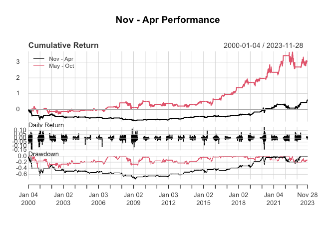 MSFT Seasonality in R
And this is what MSFT looks like from the year 2000 in Python.
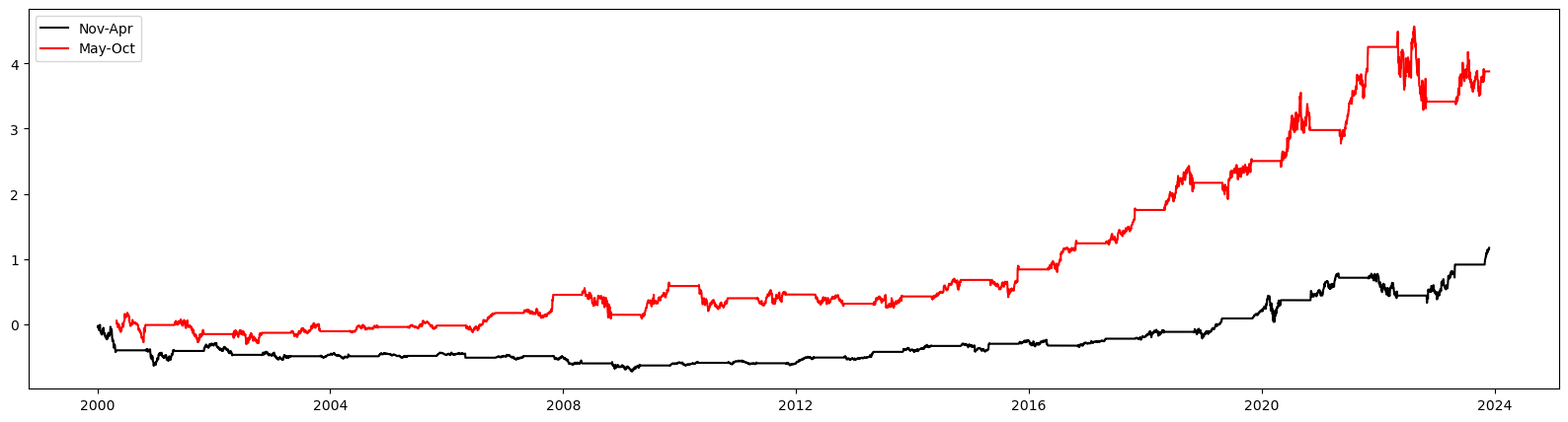 MSFT Seasonality in Python
Granted I need to add the drawdown and the daily return part to the Python code, but the hard nut has been cracked.